
Let's keep this guide simple: form matters.
Fabio Muratore
Set Your Priorities
 How do I quickly skim over your paper? Exactly, I read the abstract, have a look at the figures as well as equations, and maybe give the conclusion a chance. Thus, these parts are your top priority. There is no excuse for messing them up. If these essential parts of your work look like you don't care about details, I instantly judge you. Not (only) because I am a bad person that is quick on the draw, more because I have no time to read/review all the papers that are out there, and thus prune the tree early. The goal is to not die at this early stage.
Different people are triggered by different (mostly little) things. For me, it is sloppiness. Therefore, this guide is more about avoiding stupid mistakes, and less about the actual content. Pro tip: if you want to check if Jan is reading your draft, start some sentences with "This is ..." and wait for the feedback that will prevent you from ever doing this again ;)
The Abstract
I highly recommend reading about how to write abstracts in the paper writing guide in our wiki. Answer the four listed questions in your abstract without writing a book.
Bad Style Example
- Write it all in one paragraph.
- No citations or equations in the abstract. Even if your paper is very theoretical, or you are convinced that your method is very much based on a specific publication, the abstract is not the right place. Putting these things into the introduction or method section is a way better style.
- No fancy symbols or bloody emojis in the abstract or title. Really, you included Zapf-Dingbats symbols? Undo that, and don't tell anybody.
- Get your quote ticks right. There is a `\enquote*{}` command in latex (csquotes package) which makes things a bit easier.
- Avoid acronym definitions except if it is about the method you introduce and you use it multiple times. There is really no point in defining "RL" in the abstract.
The Figures
I summarized my workflow on how to create or annotate figures such that they integrate seamlessly in latex documents. It might seem, difficult the first time, but trust me, everybody can do it and the time you put in pays off.
- Don't follow the Pareto rule for figures. It is worth going for more than the first 80%.
- Legends or labels are awesome, but not so awesome that you have to repeat them all the time. If you plot in a grid, you can save space by plotting them once per row/column.
- Captions are the reader's best friend. Explain what can be seen in this figure, but do not interpret it here. Do that in the main text. For example, useful information in a caption below a "results" figure would be to describe how the parameter/setup configuration of this experiment was different from the others.
Good Style Example
- If you have not too many data points (here along the x-axis), annotating the individual samples helps to show where you evaluated and what is interpolated.
- You can make the legend a subplot, or put it into one of your plots, depending on what makes sense for the current constellation.
- Note how the y-label is only on the very left plots, and the x-label is only on the very bottom plots. In the end, this saves space which allows you to produce cleaner and more legible figures.
Bad Style Example
- There is a reason for predefined color maps. After all, your figures should be visually compelling.
- No ticks? Really? Just don't do that. Some folks are big fans of girds. I guess this is a question of personal preference.
- One good thing about these two plots is the highlighting using a vertical line.
Good Style Example
- Different types of data profit from different types of plots. Quite obvious, I know. However, it may require some trial and error to figure out what works best. A good point to start is possible symmetries in your data.
- For benchmarking or ablation studies, you might want to give the radar a.k.a. spider plot a chance.
Good Style Example
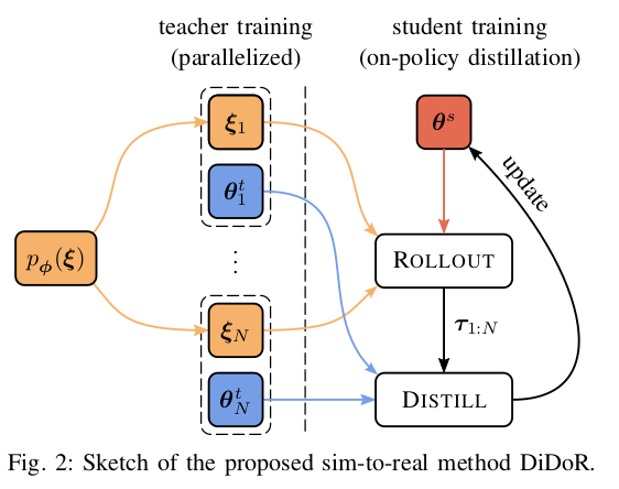
- Pictures are just way more attractive than text. So why not enrich the description of your method with an illustration? Yes, yes you say it all in the text. However, you want to make it as easy as possible for others to grasp the key points of your approach.
- Notice how the text in the caption is the exact same as in the figure.
The Equations
Equations should always be part of a sentence. They are basically the neurotic partner of your sentences that can not be alone, ever.
Bad Style Example
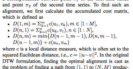
- Never use $min$ as this reads as (:latex:)$m\cdot i \cdot n$(:latexend:) but use $\min$ instead which becomes (:latex:)$\min$(:latexend:).
- Do not use bullet points in any paper to list eqautions.
- Use the `align` environment in latex such that the equal signs are all aligned.
- Some people dislike the word "calculate".
- Make sure that the last line (:latex:)$D(n-1,m)\ldots$(:latexend:) is aligned with the (:latex:)$D(n-1,m)\ldots$(:latexend:) above.
Bad Style Example
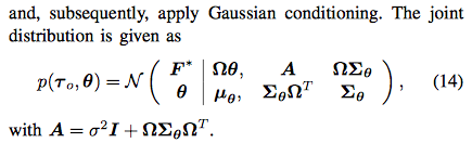
- You do not "apply Gaussian conditioning", the formulation makes no sense. Instead, you condition on a variable x.
- This way of writing a Gaussian is meaningless. The vectors and matrices should be written as such.
Good Style Example
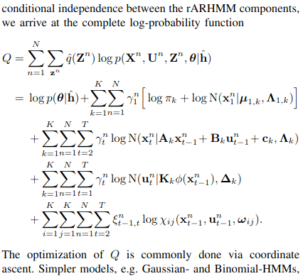
- This is how you should do it. Even though this equation is very long, the terms have been grouped such that we can grasp them individually really easily.
- Isn't it nice to "arrive" at equations? We immediately feel at home.
- Also note the sort explanation after the equation. These make it easy for the reader to understand what is going on / important.
Good Style Example
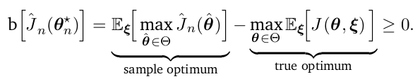
- You can use the `\underbrace{}{}` command to highlight certain terms. Initially, I thought this is stupid advice, but I got a lot of good feedback from others for this minor thing.
- Some people, looking at you Marc Deisenroth, also use colors to highlight terms or groups of them. This is a question of personal taste. Personally, I think it helps, but watch out because several conferences and journals forbid non-black text.